
Executive Dashboard
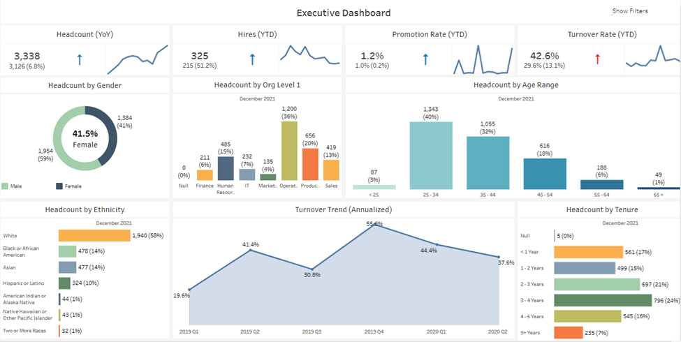
The purpose of the executive dashboard is to provide some key data points and metrics at a quick glance. Simple trend lines, specifically targeted breakouts and directional arrows help to visually tell the story. Filtering is also kept to a minimum to keep the focus on these key points.
Trend Dashboards
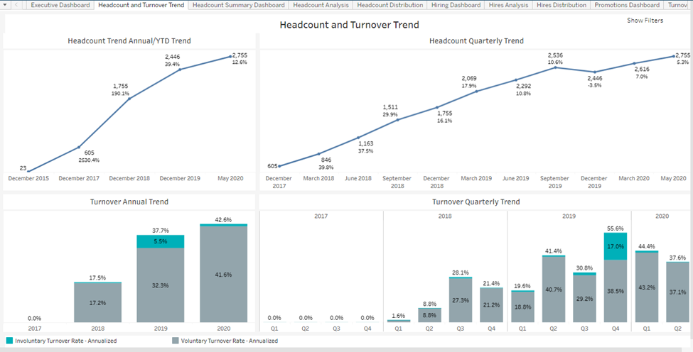
The purpose of this view is to provide trending information across a longer period of time, focusing on the overall headcount and growth. The view provides many options to drill down into smaller time frames by using the ‘+’ feature. For example, hovering over the quarter breakout with provide the "+" option to drill down to the month level.
General Dashboards
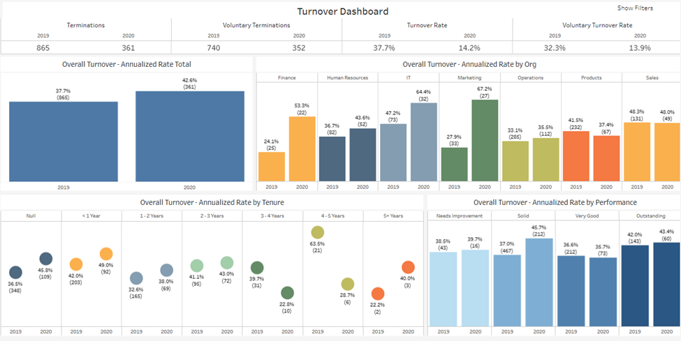
In your workbooks, you will find many different dashboards that focus on a particular area. These dashboards often combine trends, comparisons and breakouts that provide an overall picture of the metric in question, such as turnover. Typically, you will find several filters on the right hand side for additional flexibility.
Analysis Views
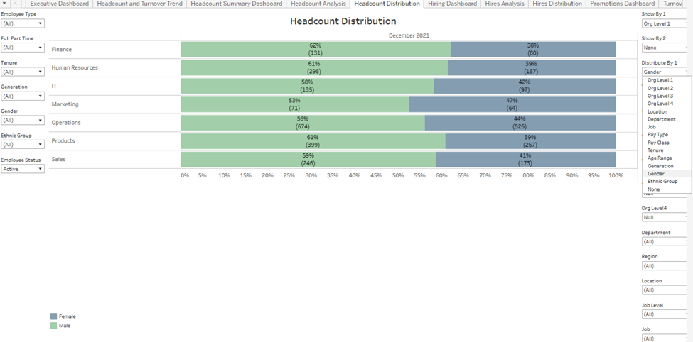
Analysis views are comprised of a single chart typically displaying one metric, with several filters and ShowBys available. The purpose of these charts is to provide a large amount of flexibility when you combine ShowBys and filters. Furthermore, when selecting multiple dates, additional columns will appear. This will allow you to compare across time for the specific dimensions selected.
DEI Dashboard
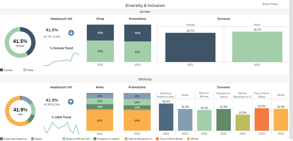
The Diversity and Inclusion Dashboard is designed to provide key analysis for specific groups of interest. In a single view, you can quickly understand the gender or ethnicity breakout of your current employee population, as well as hires, promotions and turnover over a specific time period.