
(To see a larger version, right click and open image in new tab)
Business Problem: The customer needed a detailed view of onboarding effectiveness across various locations to identify areas for improvement in new hire integration and engagement. However, while CultureAmp provided survey data, it couldn’t be combined with Workday insights to offer a comprehensive view that also accounts for employee demographics and role-specific factors.
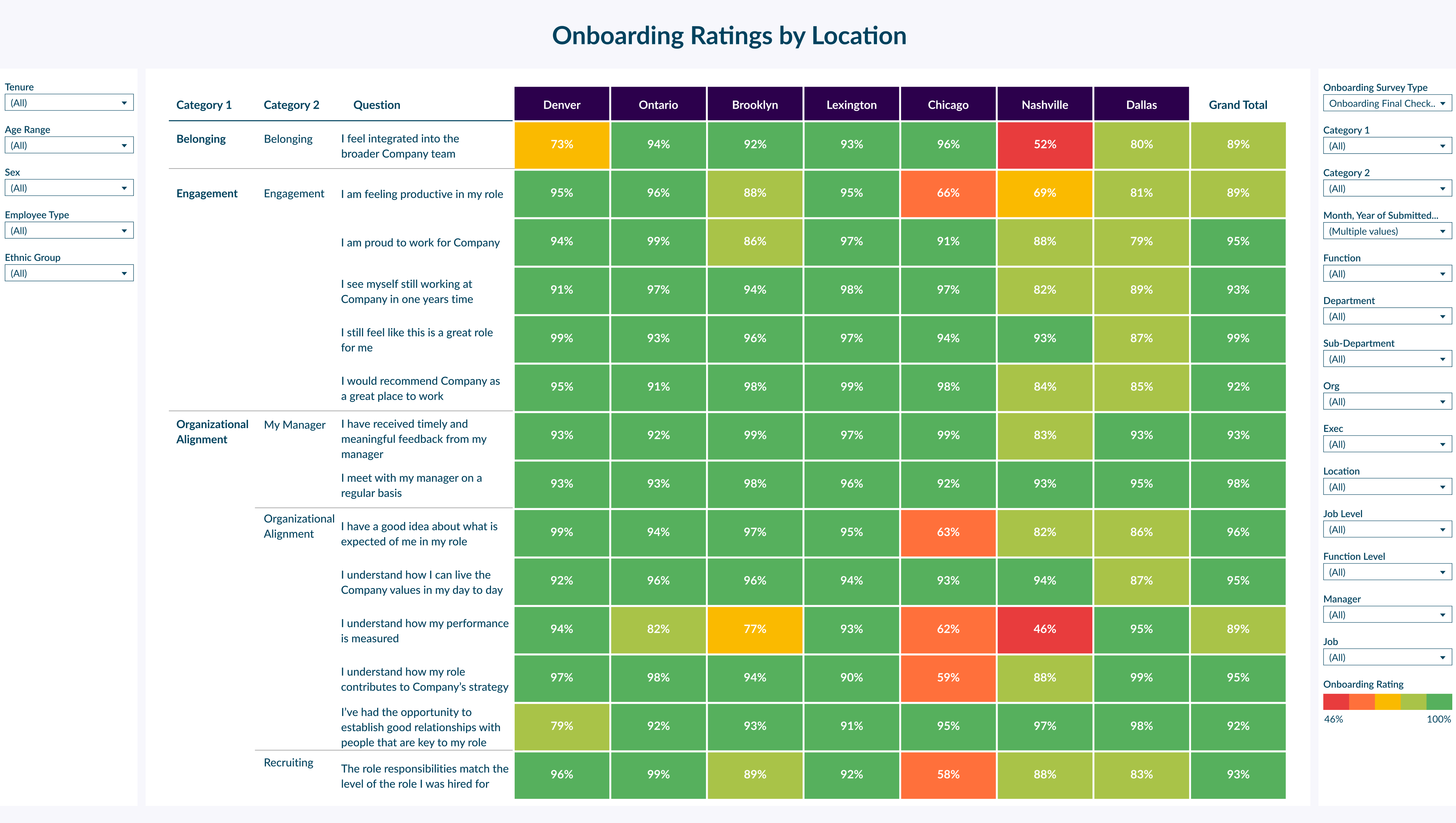
How This Dashboard Helps: This dashboard connects data from CultureAmp onboarding surveys with Workday’s employee data, providing a location-based view of onboarding effectiveness across key metrics such as belonging, engagement, and organizational alignment. By combining these data sources, the dashboard allows the customer to drill down by location and demographic factors like tenure, department, and job level, something that CultureAmp alone could not achieve.
The heatmap displays ratings by location, making it easy to spot trends and identify areas where specific locations may need additional support. For example, it highlights locations where scores for manager feedback, role expectations, or integration are lower, signaling potential areas for targeted onboarding improvements.
Impact: By integrating CultureAmp and Workday data, this dashboard provides a holistic view of the onboarding experience, allowing the customer to make data-driven adjustments that improve new hire engagement and retention. HR teams can now address specific onboarding challenges at underperforming locations and create tailored strategies to enhance the experience for new hires across all offices, supporting a more consistent, positive onboarding experience company-wide
Please note: The dashboards featured in this workbook are design mock-ups inspired by real customer dashboards. Data and calculations are not reflective of real data